Before we dive straight in, what brands spring to mind when you think of ‘strong brands’? We bet you can recall their logo, colours and theme styles, right? We’re going to explain why Brand Guidelines are a key ingredient to developing this recognition and a strong brand, and what should be included in them.
What are Brand Guidelines?
<style=”font-size:16px;”>Brand Guidelines include a set of rules that outline how branded components should and shouldn’t be used. Brand Guidelines are often printed in a physical book format, but the digital copy will also exist so that when designers create new marketing materials, they can follow the guide and prevent misuse or mistakes. Creating a set of Brand Guidelines to follow, is a brand’s key to consistency.
What should Brand Guidelines include and look like?
There are common features of Brand Guidelines regardless of what brand they are for; although no two Guidelines will look the same, a general rule of thumb is followed for content. Here is a list of what Brand Guidelines may consist of (not all brands will include all of them):

• Colours – Colours are a very important part of a brand’s identity. A strong brand will often be distinguished by its colours, so in order to maintain an identifiable brand, it’s wise to ensure colour consistency. Brand Guidelines will likely state a colour palette to adhere to, with reference to alternative colour splits depending on the media type or format, for example: RGB colour splits for on screen, CMYK values (which may vary depending on finishes of printed items) or specific pantone references. (If you’re creating a brand or considering a rebrand, take a look at this blog post to guide your colour decisions, click here).
<style=”font-size:16px;”>• Logo variations – Most brands will have slight variations in their logo to adapt to different themes, layouts or formats. Here are examples for each:
<style=”font-size:16px;”>Theme – A logo may need to be greyscale/solid black/solid white to match a specific theme or so that it’s visible on a particular image or background.
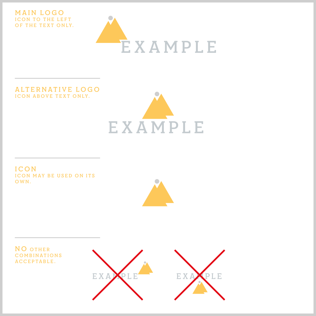
<style=”font-size:16px;”>Layouts – If a logo consists of an icon and text, there may be different ways they are displayed e.g. icon to the left/right of the text, icon above/below the text, or the icon/text alone. Any variations, including when and how they should be used, can be stated in Brand Guidelines. Another rule to consider referencing is how far away a logo should sit clear of other elements or from the edge of a page. Many companies have this rule to ensure that their logo will stand out and isn’t crowded.
<style=”font-size:16px;”>Formats – Logos may need to be saved in different file formats to cover a range of media types. Guidelines can state which format should be used for each media type to ensure colour consistency and high resolution.

<style=”font-size:16px;”>• Typography – Each typeface has distinctive connotations that are conveyed. Although not all brands select their typefaces strategically, the strategic way to choose them is through researching them first. Find out what they mean and select ones that align well with the ‘feel’ and voice of your brand and amplify them both. Using typefaces that perfectly represent your brand, keeping them consistent, builds up your brand’s image in your clients’ minds and develops a strong brand identity. So, be sure to include them in your Brand Guidelines.

<style=”font-size:16px;”>• Tone of voice – Tone of voice is the way in which something is said. Every brand should have its own recognisable and distinctive tone of voice that reflects the personality of the brand. It does not refer to spoken words but a company’s written copy, such as: social media posts/messages, printed and digital marketing materials, website(s), emails etc. A great example would be to look at Innocent, they follow an informal, relatable and friendly tone of voice that wins over their audience! This is kept consistent across all their written copy, (you can read more here). In addition, tone of voice is a key brand characteristic that should remain consistent, which is why it’s a common feature of Brand Guidelines.
<style=”font-size:16px;”>• Graphic elements and symbols – Graphic elements and symbols are the additional details and components that contribute to a brand’s style. This refers to elements such as blocks of colour, shapes, patterns, lines etc, that a brand frequently utilises in their complete designs. With repeated use across all branded content both online and offline, they help create a brand that has its own identifiable style. These graphic elements and symbols can be put in Brand Guidelines as a library of different elements to pick from, but all of which are on brand. This will allow a variety in design without straying from what’s ‘you’.
<style=”font-size:16px;”>• Images – Occasionally referenced within Brand Guidelines is what style of images can be used; sometimes within regularly updated Guidelines is a set bank of images to choose from. This section can include rules on: specific positioning, layouts, formats, themes etc.

<style=”font-size:16px;”>• Don’ts – Some Guidelines include a specific ‘don’ts’ section, whether it’s a segment in each of the above or stand-alone. Rather than just stating the elements that can be used and how to use them they will strictly outline the rules to prevent misuse, and ensure everything always meets the right standard. An example could be, ‘don’t distort, angle or mirror our logo icon.’
<style=”font-size:16px;”>Now we’ve educated you on the importance of Brand Guidelines and what to consider including in them, we hope you’re eager to embark on your journey to a strong, identifiable brand.
<style=”font-size:16px;”>Let us know if you found our blog post useful and share your journey with us on Twitter @birchprint using #BPRateOurBrand.


